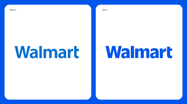
America’s retail giant has made significant promo noise announcing an update to its well-known wordmark and ‘spark’ logo. But critics are asking how significant the change is. And some are even asking, why did Walmart bother to fiddle it’s logo at all?
 The new Walmart Logo: Alongside the previous version… Bolder
lettering and a ‘brighter’ blue. Need they have even bothered?
My first reaction when I saw the new Walmart logo was to paraphrase Winston Churchill: “Never in the course of marketing history has such a large corporation paid someone so much for so little…”
Social media mockery ensues
Legions of social media commenters rushed to agree with my analysis of the new Walmart identity.
“It looks the same,” wrote one X user. Just one of many similar sentiments.
“I can’t believe someone got paid for this,” another posted.
“A complete overhaul has long been overdue, and while some may be uncomfortable with this radical change, it was time,” another X denizen observed, tongue firmly in cheek.
Straight-faced illucidation
The company goes to some lengths to explain – and justify – the minuscule changes in a lengthy, detailed news release…
“Walmart is excited to announce a comprehensive brand refresh that reflects its evolution as a people-led, tech-powered omnichannel retailer,” the grand announcement begins. Sets one up to expect great things, indeed!
The release goes on to trumpet ‘some key features of the brand’s refresh’:
- The wordmark is inspired by Sam Walton’s classic trucker hat and brought to life with a modern, custom font that differentiates Walmart from the crowd.
- The spark exudes the energy of Walmart and remains a beacon that guides customers through all facets of the Walmart experience.
- The color palette — True Blue and Spark Yellow — leans on the retailer’s most recognizable tones and its heritage of blue, while ushering in new updates to keep the brand fresh.
- The tone is relatable, approachable and representative of the millions of customers that shop with Walmart, whether conveyed through its brand voice, illustrations or photography.
In reality…
The change-up is almost microscopic. At least in a clinical sense. But what is the noticably bolder version of the same basic font and marginally darker shade of blue supposed to convey?
“The updated brand identity will help Walmart build credibility and connection, become known for its convenient digital-first services and be seen as a more modern, culturally dynamic brand,”
My take
Sorry, but the alleged ‘comprehensive brand refresh’ doesn’t convey anything new or different to me, at all. You’d have to see the new logo and the old one side by side (as shown above) to notice any difference at all.
Is the effect supposed to be subliminal? Subconscious? I don’t know. But I suspect the retailer doth protest overmuch, about the grand aims and objectives of its new brand identity. In fact, it appears to me that Walmart – rather than wanting to make any major, comprehensive changes – wanted to fiddle as little as possible with the basic look that’s worked so well for it lo these many years.
I suspect that Walmart, in fact, wanted an excuse to trumpet it’s resolve to, “build credibility and connection, become known for its convenient digital-first services and be seen as a more modern, culturally dynamic brand.” Without risking damage to a good thing.
Whatever the changes to the logo, they’re not going to entice me to buy any more groceries from Walmart than I already do…
~ Maggie J.

