This past week has seen two egregious examples of major Foodsphere companies making bad decis-ions. And being held to account by their fans. Why do food mega-brands jump in and fiddle with classic elements of their corporate identities?
![]()
What happened at Walmart?
First Walmart (for no apparent reason) launched what it called, “a comprehensive brand refresh that reflects its evolution as a people-led, tech-powered omnichannel retailer.”
Many folks took a look at the new logo – and wondered why the mega food retailer even bothered to roll out the changes, at all. Indeed, the vast majority of fans (and even some marketing experts) went as far as to say, you couldn’t tell that any changes had been made. Not unless you placed the old and new wordmarks and logos side by side (as shown above) for minute comparison.
The only palpable differences are, the use of a bolder font for the wordmark and corresponding ‘spark’ symbol. And (marginally) brighter hues of the same, old colours for both. In other words, nothing like the ‘comprehensive brand refresh’ the mega-retailer advertised.
What happened with Doritos?
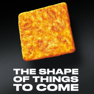
Doritos UK went all-out (or in, depending on what they say where you live), launching a new square version of the 60-year-old classic corn chip. It’s the first structural change to the iconic dipper the brand has attempted to float since it premiered. And fans flocked to their social media accounts to complain.
Doritos UK trumpeted the change as, ‘The Shape Of Things To Come’. Fans were quick to scold their beloved brand for fiddling with a classic.
Social media comments ranged from: “A Dorito [that’s not] a triangle shape is no Dorito at all,” to one-word exclamations such as (but certainly not limited to), “BOOOO!”
One Doritos lover offered specific instructions to the brain trust behind the snack: “Bring back the old recipe before you did the bold crunch!”
My take
As for the Walmart’s non-comprehensive brand refresh, I’m compelled to recall the lament William Shakespeare wrote for the failing MacBeth, about life in general: “A tale […] full of sound and fury, signifying nothing.”
I suspect that Walmart really didn’t want to diddle too much with it’s already highly identifiable graphic look at all. But felt it needed an excuse to boast about what a great, modern, up-to-date organization it has ‘evolved’ into.
Doritos, on the other hand, obviously did want to make a change that would scream ‘new’, ‘daring’, and perhaps even (judging by the language of the new slogan) ‘revolutionary’. But did no one in their marketing department foresee the ruckus fans would make if the Doritos ‘establishment’ fiddled with ‘perfection’?
One astute marketing expert also notes that the brand recently – without warning of any kind – reduced the weight of it’s most popular bag size from 180 g to 150 g. Egregious shrinkflation, to say the least! The expert opined as Doritos UK wanted to create another ‘scandal’ to draw fan attention away from the packaging shrink.
In both cases. I’m reminded of the warning, from John Wyndham’s The Crysalids, that, “A lot of people saying that a thing is so, doesn’t prove it is so.”
My questions for you:
Did Walmart really believe it could convince its fans that it had made any significant change in its graphic image using it’s largely hands-off strategy?
Did Walmart feel it had to claim a ‘comprehnsive’ image makeover to match claims of a highly-touted (but imperceptable) corporate ‘evolution’?
Did Doritos UK brand managers really think fans could be fooled by such a superficial, cynical move as trying to create a diversion to conceal their shrinkflation sins?
Do you agree with the social media commenter who protested, ‘A Dorito [that’s not] a triangle shape is no Dorito at all’?
Do you agree with the Doritos UK spokesperson who claimed that a square Dorito has more scooping surface, and is, therefore, superior to a triangle?
What do these cynical moves by two very different corporations say to you about their respective views of their fan bases?
Muse on that…
~ Maggie J.